
Originally published on Firechief
Research reveals the impact of commonly used station colors on firefighter mental health and stress.
Physical health and safety have moved to the forefront of fire station design, but little design consideration has been focused on the mental well-being of the first responders living and working inside.
The architectural design of a fire station not only addresses living quarters, traffic flow and layout, but also the functional needs for services provided, community events and personnel lifestyle. Interior elements such as lighting, sound, temperature and even smell have been explored by designers to help improve quality of station life. However, little attention has been given to the impact of color in the built environment with regard to well-being.
For the past several years, I have been researching the connection between firefighter well-being and architectural surroundings. I ultimately focused my research on the impact of color on stress and firefighter wellness. Here’s what I found.
THE MIND AND BODY IMPACT
Research shows that there is a connection between brain function and the immune system response. As explained in “Color – Communication in Architectural Space,” since this interaction begins “at the very moment we begin to perceive sensory stimuli,” it is important to pay attention to the environment in which one works and lives. As such, the architectural space can and should be designed to impact the senses in a positive way, therefore contributing to a healthier immune system.
Further, the space should be designed to lower stress, particularly as Psychologist Dr. Nicola Davies indicates that “prolonged stress is one of the leading causes of health problems among firefighters.”
Mental stress can also lead to a physical ailment called psychosomatics. Psychosomatics is a disorder with physical symptoms, but originating from mental or emotional causes – an influence of the mind on the body and the body on the mind.
Color in architectural space can have both mental and physical effects. Faber Birren, considered one of the best-known color authorities worldwide, states in “Color and Human Response,” “People require varying, cycling stimuli to remain sensitive and alert to their environments.”
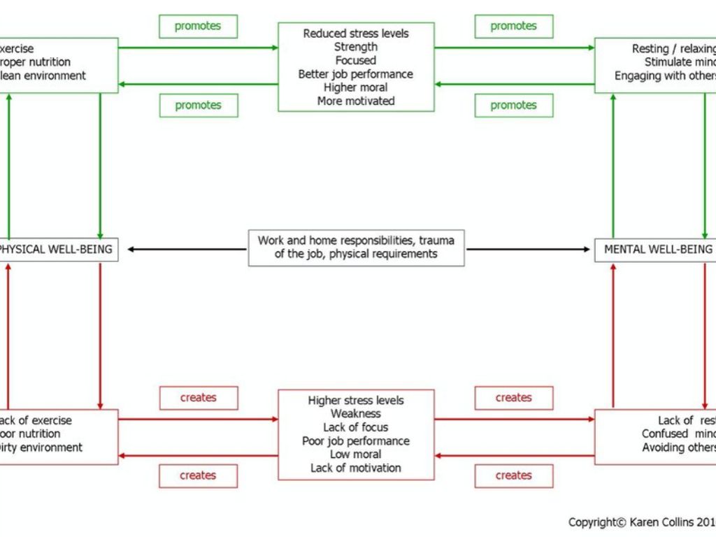
This flow chart demonstrates the cycle of mental and physical well-being and the positive and negative effects. At the center are typical stressors experienced by first responders.
WHY COLOR MATTERS
Differences of opinion on response to colors have been written as truth for decades. Many of these are based on weak studies, personal conviction, legends and tradition. As the authors note in “Color – Communication in Architectural Space,” “It is a mistake to assume that we could strategically place color in a space so as to achieve specific physiological effects….” So although here are no color “recipes” that will lower blood pressure, relieve stress, curb appetites or any other magical solutions that many designers and decorators choose to follow, there are guidelines to keep in mind.
People subjected to an under-stimulating environment experience the following reactions: restlessness, anxiousness, or nervousness; sleeplessness; irritability; excessive emotional response; difficulties in concentration; and perception disorders. Further, according to researchers, a monotonous environment can cause sensory deprivation and be harmful to healing. Under-stimulating environments are evidenced by weak or monotonous color contrasts, monochromatic color combinations, or low intensity of color. Psychologist Ayben Ertem writes in “The Effect of Color in Psychology,” “… a completely white environment leads to lack of stimulus and this, contrary to expectations, does not cause a balanced or neutral effect.”
People subjected to an over-stimulating environment experience the following reactions: increase in rate of breathing, pulse rate and blood pressure; increase in muscle tension; and various types of psychiatric reactions. Over-stimulating environments are evidenced by highly saturated colors, complex color combinations, strong contrasts or excessive color patterns, per “Color in Architecture – More Than Just Decoration.”
MAKING THE FIRE STATION COLOR CONNECTION
The color red is not only a historical color for the station, it is a color that many firefighters identify with due to tradition and familiarity. It’s no surprise that there is an excessive use of bright red throughout fire facilities.
A typical color scheme seen in many fire stations today includes red accents against white walls. Without other colors to balance the space, there is no adequate surface to provide rest for the eye. The International Association of Color Consultants teaches that extreme contrasts of light and dark (such as white and red) must be regulated to avoid constant adjustment of the iris muscles which is cause for undue stress. Applying colors with lower light reflectance, plus balancing the bright red with softer cool tones, would alleviate eye strain and create a more harmonious space for spending several hours at a time.
Additionally, there are a few common misconceptions about white or off-white walls that we can dispel with some facts:
- White is a neutral color. Fact: White will “jump out” as any other bright color, unlike colors with lower light reflectance, per “Colors for Your Every Mood.”
- White walls will brighten the space making it easier to see. Fact: White walls are an optical strain due to high light reflectance.
There are other reasons to consider the impact of color as well. Anthony Crocamo campaigned in his article “Designing Fire Stations to Attract and Retain Members” for ways to attract and retain station members. He argued that “a spartan environment won’t attract new members or give current members much reason for staying on. Providing a comfortable environment for today’s firefighter is required,” and encouraged the banning of drab color schemes in the living and community quarters.
In an interview with Captain Mark Werner of Columbus, Ohio, Werner noted: “Busy houses have happier firefighters. There is no time to complain or dwell on events witnessed.”
Since a daily routine doesn’t always include emergency runs, it is important to consider the design for the non-busy times. Monotonous spaces cause thoughts to turn inward. To better minimize stress, avoid these environments that tend to encourage unhealthy inner thoughts.
KEEPING AN EVEN KEEL IN TIMES OF STRESS
Color harmony is imperative for minimizing stress. Color combinations are harmonious (or orderly) not because of personal preference, but because of the position of each individual color with regard to other hues in a scientific color system. Color harmony is achieved when the eye is no longer seeking to balance the color. An understanding of color and color systems is imperative when applying this concept to the architectural space.
As Birren writes in “Color and Man-Made Environments”: “Color in a man-made environment is far too vital to man’s well-being for its choice to be left to personal whim or fancy. Color has the ability to serve man’s physiological and psychological needs and to help keep him on an even keel in time of stress.”
Reducing stress levels of firefighters is beneficial for the individual and for the department. With this in mind, creating environments with a positive influence on physical and mental well-being should be a high priority of fire station design.